Late 2024 to 2026Shipped
Care Plan
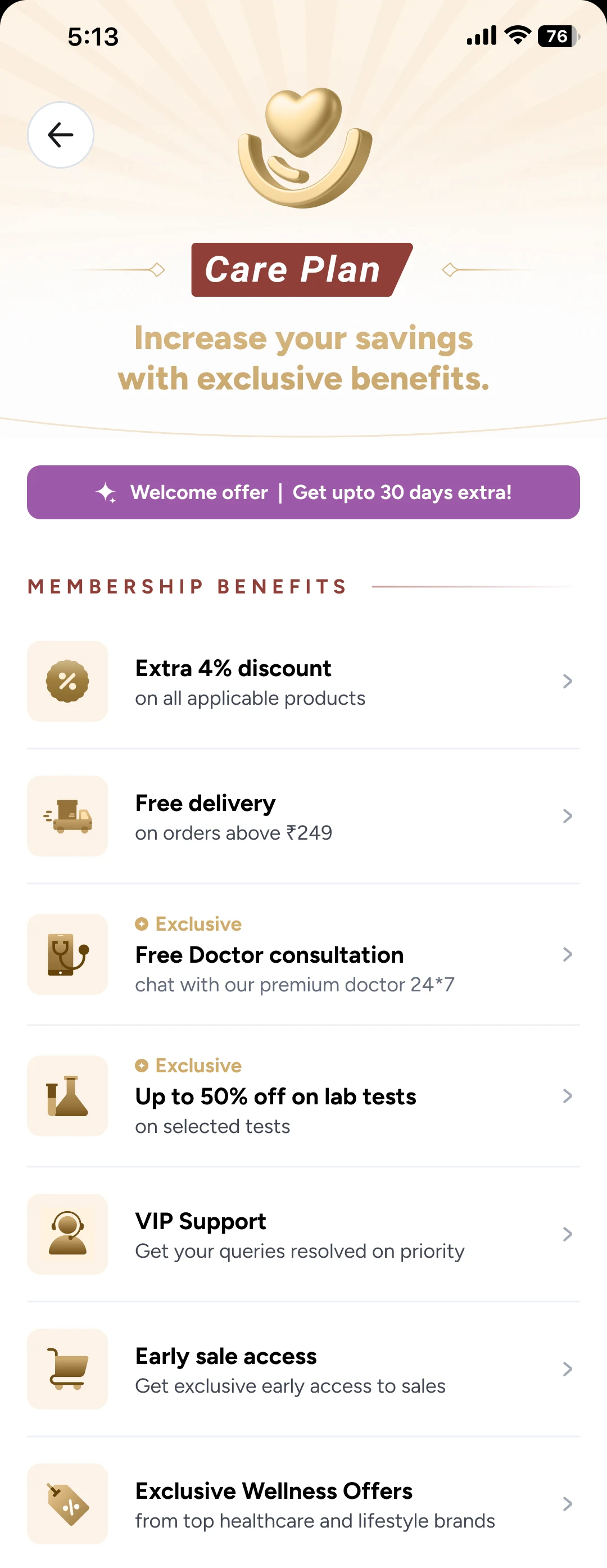
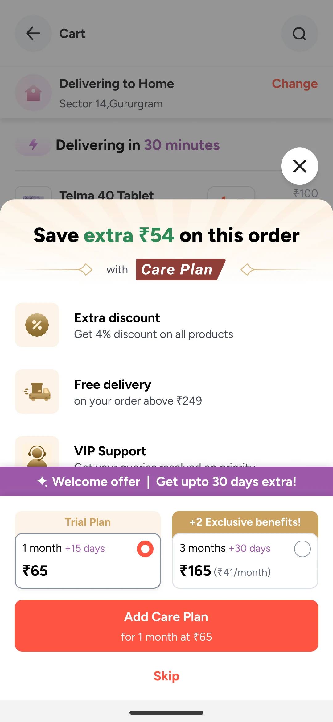
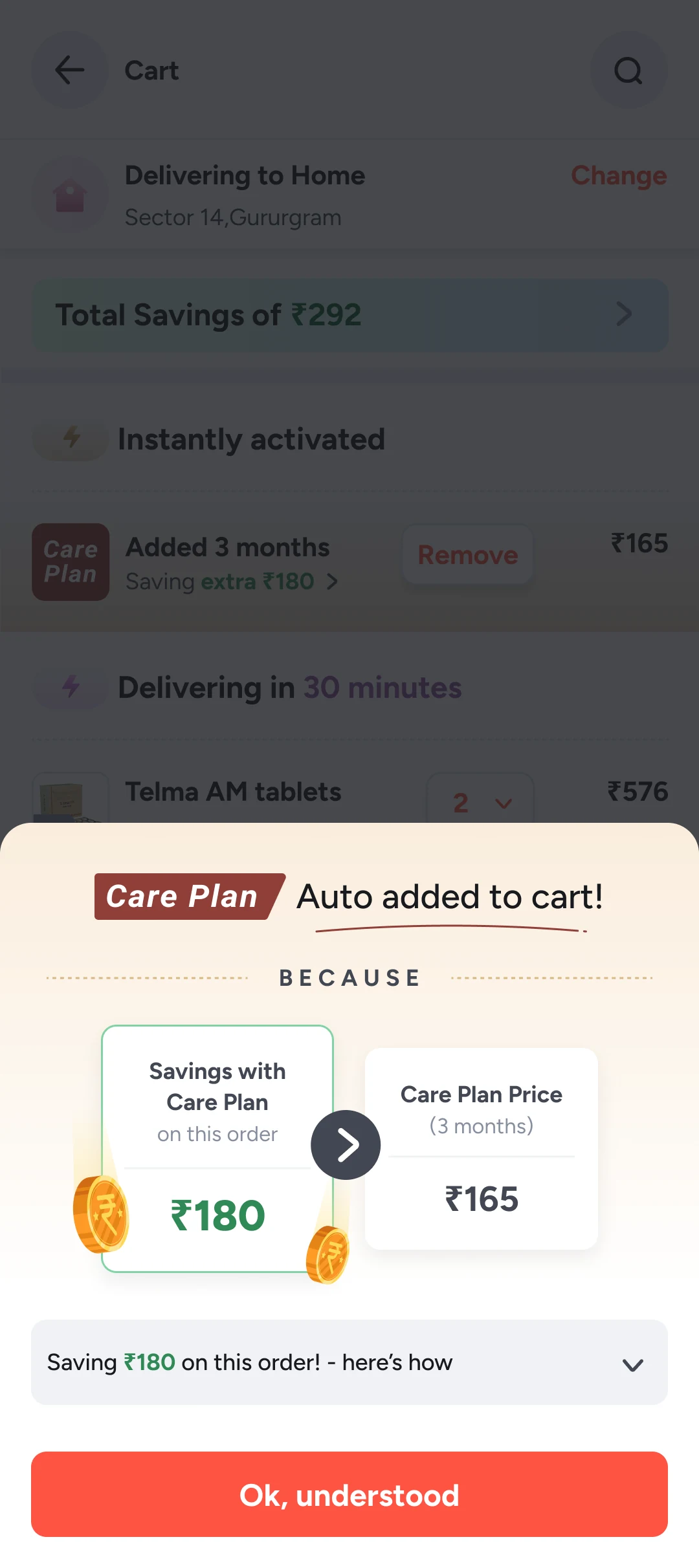
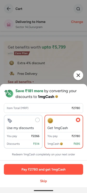
Making Care Plan honest about what it costs and what it gives
Currently doing an MSc at Politecnico di Milano
Designer with specialisation in Product, Motion, AI and Research
Previously at
 Product Designer I, 2024 to 2026
Late 2024 to 2026Shipped
Making Care Plan honest about what it costs and what it gives

B.Des, IIITDM JabalpurConcept
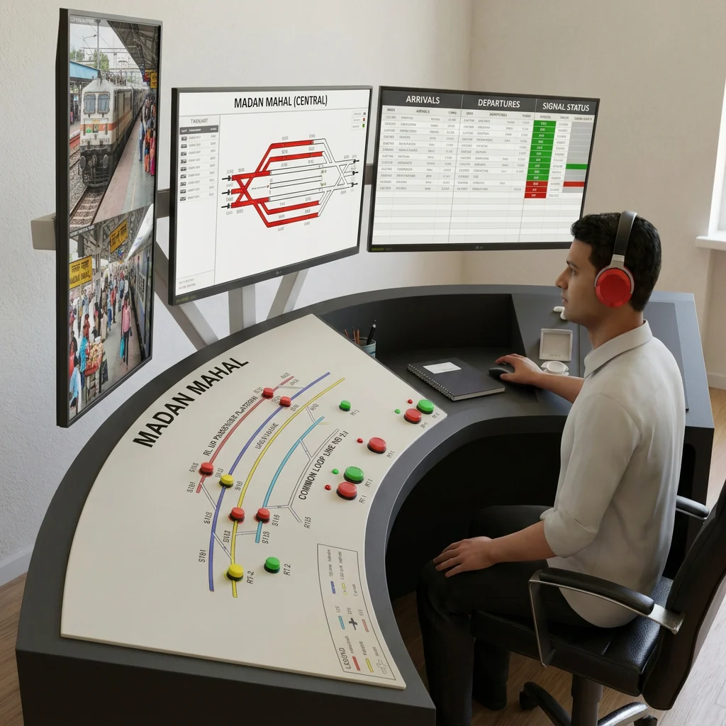
Redesigning a station master's control panel
Products I am building, freelance and side projects.
Open to new roles
Helping people find the feature that brought them back
Tata 1mg · Done-in-OneShipped8 min read
I made Tata 1mg's prescription upload easy to find. Retention rose about 20% over six months, and demand outgrew the pharmacist team.
Numbers shown as percentages
Most of us know the routine at a local pharmacy. You hand over your prescription, the pharmacist squints at the doctor’s handwriting, works out the doses, and hands you your medicine. You don’t have to understand any of it.
Done-in-One does the same thing inside the Tata 1mg app. You upload a photo of your prescription, and a pharmacist at 1mg reads it and fills your cart for you. AI was being trained to read prescriptions too, but back then every one was checked by a person. 1mg built the feature years ago, and other pharmacy apps have since copied it.
In early 2026, our goal for the quarter was simple: get people to come back. Services like Done-in-One are what make 1mg different, so that’s where a PM and I started. I led the design. The PM got us the data, the developers and time with leadership.
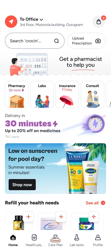
The numbers told a strange story. Hardly anyone saw the way into Done-in-One, and even fewer tapped it. New users almost never did. But the people who found it finished the whole flow, rarely gave up halfway, and kept coming back.
The feature wasn’t broken. People just weren’t finding it
To understand why, we called people who used it and watched how people moved around the home screen. Two things stood out.
First, the banner confused people. It said “Order with a prescription”, next to a button that said “Order now”. People read it as a rule, not as help.
“Does this mean a prescription is mandatory?”
“The CTA is unclear on what I am going to do.”
Second, people open a pharmacy app knowing what they want, so they go straight to the search bar. Our banner sat just below it, in exactly the spot everyone rushes past on the way to search.
Handing over a prescription is as normal as asking for a medicine by name. So it should sit right next to search. I sketched five ways to do that. Two of them kept it as a block under the search bar, and they lost quickly: people would skip them just like the old banner, and they pushed the rest of the home screen down.
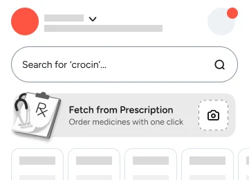
A card under search
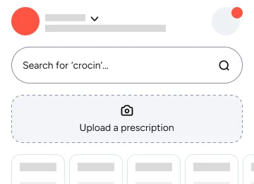
A dashed box under search
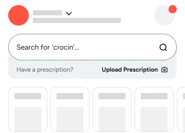
A strip under search
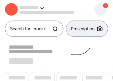
A button beside search
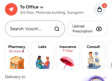
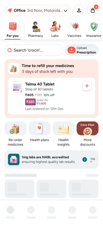
Shipped: Upload Prescription beside search
The search team wasn’t happy. A smaller search bar could mean fewer searches. We met in the middle: search keeps most of the width and stays the main thing, and the new button simply shares its row. I tested it in person with 10 to 25 people and reviewed it with the PM. Then we rolled it out slowly, to make sure search didn’t suffer.
A compact button in the same row as search. Search keeps most of the width.
Blocks under the search bar. People would skip them like the old banner, and they pushed the home screen down.
The new button says Upload Prescription. It tells you exactly what will happen when you tap, so nobody has to wonder whether a prescription is required.
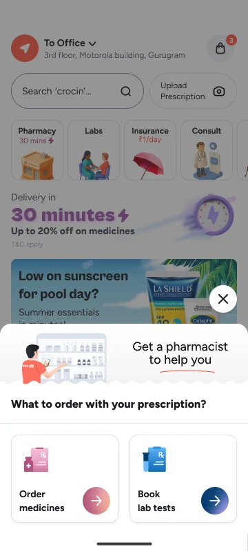
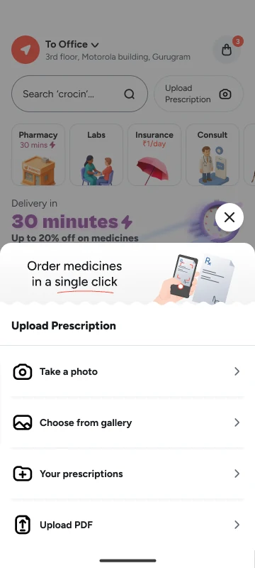
One tap from the home screen opens a short question first: what do you want to order with your prescription? Medicines or lab tests. Then comes the upload itself, with the four ways people already have a prescription: take a photo, choose from the gallery, pick one you uploaded before, or upload a PDF.
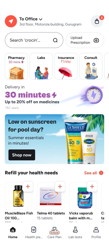
The button shares search's row, so it is already in view when someone opens the app.
"What to order with your prescription?" asks for medicines or lab tests, under a pharmacist who says "Get a pharmacist to help you".
Take a photo, choose from gallery, your prescriptions, or upload a PDF. "Order medicines in a single click" stays above, as a reminder of what you get.
The same way in sits inside search. Someone who goes straight to the search bar sees “Have a prescription? Order quickly!” above their recent searches, with Take a photo and Select a photo one tap away.
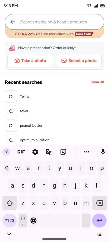
"Have a prescription? Order quickly!" sits above recent searches, where most people start.
Take a photo, or select one you already have. Both go straight to the upload.
A better button only helps people who already know what it does. New users didn’t, and a still banner is easy to ignore: people learn to stop seeing them. So I designed a short animated banner in Rive that tells the story in four beats, in a strip between the search row and the rest of the home screen.
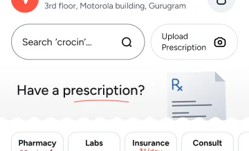
01 Have a prescription?
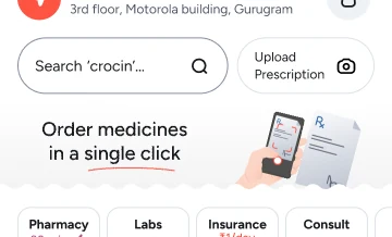
02 Order medicines in a single click
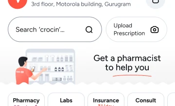
03 Get a pharmacist to help you
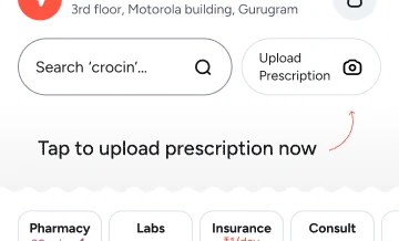
04 Tap to upload prescription now
Two rules came with the animation. The search bar’s rotating hint pauses while the button’s own animation plays, so two things never move at once. And in the version that went to everyone, the banner plays on a loop with no expand or collapse. In testing, older people liked it most, because it explained things one step at a time.
Not everyone who taps Upload Prescription is signed in, so the flow has to carry a signed-out person through to the upload without losing them.
They sign in with a phone number, or by email, or with Truecaller where it is available. A six-digit code follows, with the option to resend it by SMS or call, or to contact support. A new user adds an email address, to keep the account safe. An existing user goes straight on to the upload.
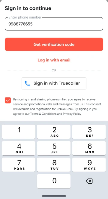
Sign in
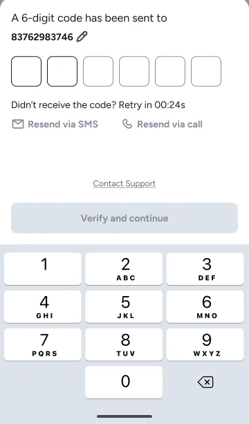
Enter the code
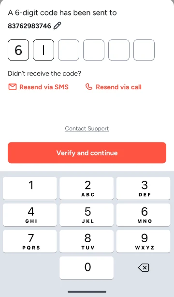
Verify
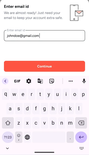
New users add an email
When I joined 1mg, most of the app’s animation was GIFs. They were heavy, they looked blurry at bigger sizes, and they made the design team wary of trying anything ambitious with motion. To me, that was part of why the app felt dated.
Moving to Lottie had already been a hard push, because developers had to learn a new way of building animation. Even then, getting from Figma to Lottie meant a chain of After Effects plugins, AEUX and Bodymovin. Basic effects weren’t supported, so animations came out flat. Worse, effects often broke on export, and we only found out once they showed up in a dev build. Then came another round of fixes.
So I pitched Rive. With Rive, we knew exactly what we’d get before a developer touched it. Text and colours can be changed from code after export, instead of re-exporting the whole file. And designers and developers can work on the same file together.
The Done-in-One banner came soon after the switch, and it became one of our strongest cases for it: proof of what Rive could do in a real feature. Across the app, the switch cut motion development effort by about 60%.
More people started using Done-in-One. So many that the pharmacists checking prescriptions couldn’t keep up. 1mg had to hire more of them, and we held back the full release to all users for almost two months while the team grew. It was the best kind of problem to have.
higher retention over six months, measured as people coming back within 30 days
people in testing said they would use it again, because they now trusted it
of holding back the full release while 1mg hired more pharmacists to keep up
Before the experiment could finish, the home screen was redesigned. That project was led by a principal product designer who wanted fewer animations that felt like marketing. The button stayed next to search, but the animated banner and most of the small interactions were removed.
The placement outlived the redesign. The motion didn’t.
We shipped a version I thought was good enough for the time we had. With more time, I’d have tested the interaction properly and spoken to people who use similar features in other apps. They were hard to find.