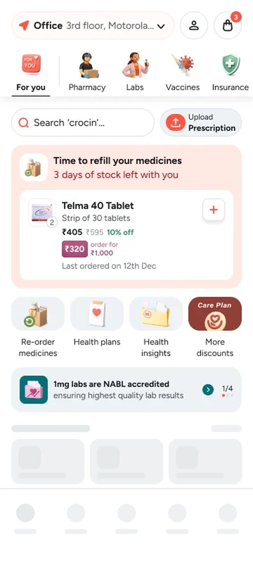
Late 2024 to 2026Shipped
Care Plan
Making Care Plan honest about what it costs and what it gives
Currently doing an MSc at Politecnico di Milano
Designer with specialisation in Product, Motion, AI and Research
Previously at
 Product Designer I, 2024 to 2026
Late 2024 to 2026Shipped
Making Care Plan honest about what it costs and what it gives

B.Des, IIITDM JabalpurConcept
Redesigning a station master's control panel
Products I am building, freelance and side projects.
Open to new roles
Making Care Plan honest about what it costs and what it gives
Tata 1mg · Care PlanShipped6 min read
As sole lead designer, I rebuilt how Care Plan shows its price and its savings. Pricing complaints went away and our transparency score rose from 5 to 8.
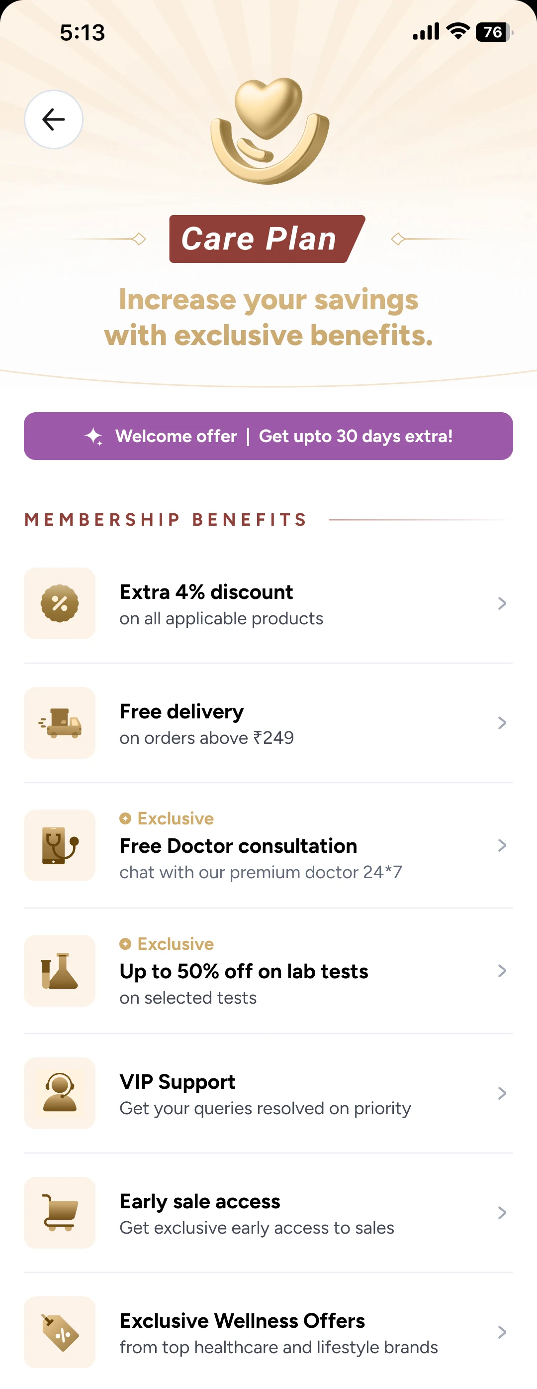


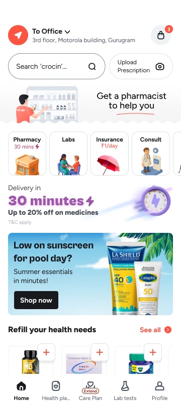
Care Plan is Tata 1mg’s paid membership. Three months cost ₹165. Members get an extra 4% discount, free delivery on orders above ₹249, free doctor consultations, up to 50% off lab tests and more.
I became its sole lead designer in late 2024. Upsells already existed in the cart, on product pages and in search.
My job was to make them better without hurting the number the team watched every day: Care Plans sold.
Make Care Plan easier to trust, without losing sales.
Complaints about pricing kept coming in. To see how deep it went, we measured it three ways.
We scored 5. The target was at least 8.
The cause was easy to find once we looked. The savings we showed were the best case.
The sheet in the cart is where most people decide. Switch between the old one and the new one, and hover a number to see what changed and why.
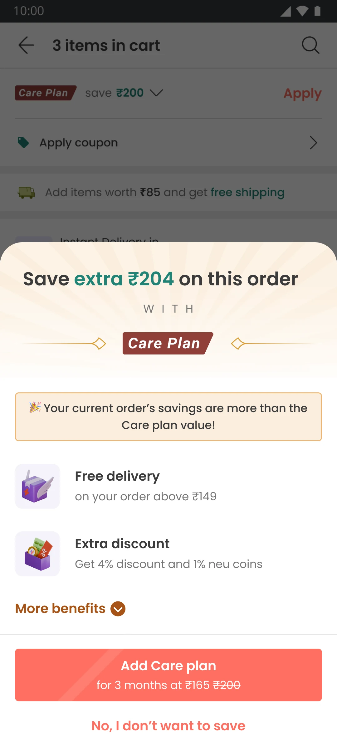
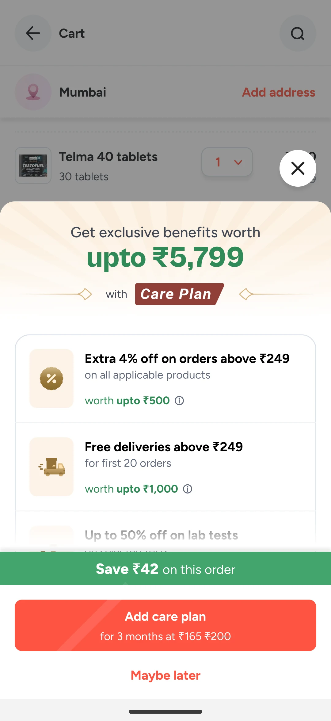
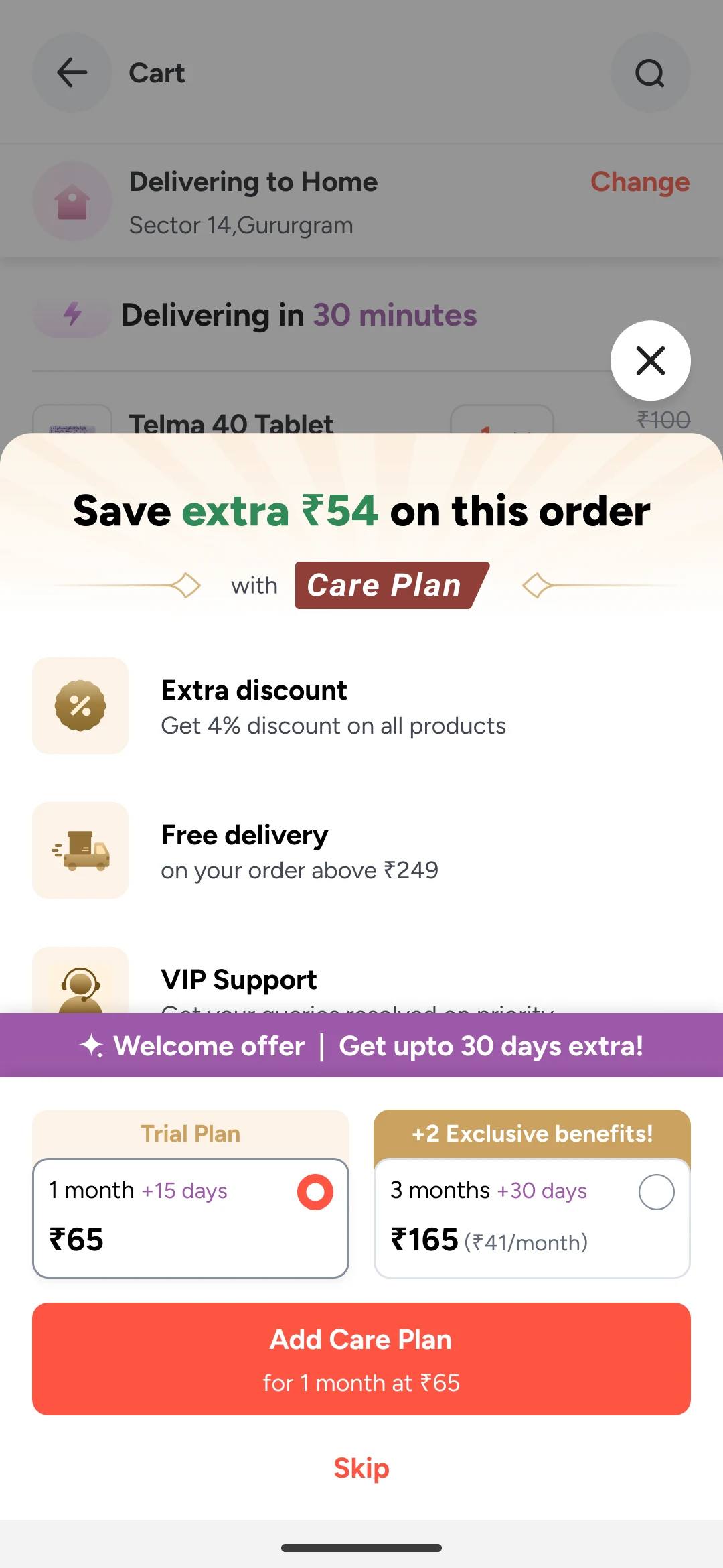
The sheet opens on "Save extra ₹204 on this order". A single maximum carries the whole offer, with nothing to check it against.
"Your current order's savings are more than the Care plan value!" tells people the plan is worth it instead of showing why.
Free delivery above ₹149 and a 4% discount, with no cap and no count of orders. People can't tell what they will really get.
"No, I don't want to save" words saying no as giving up money.
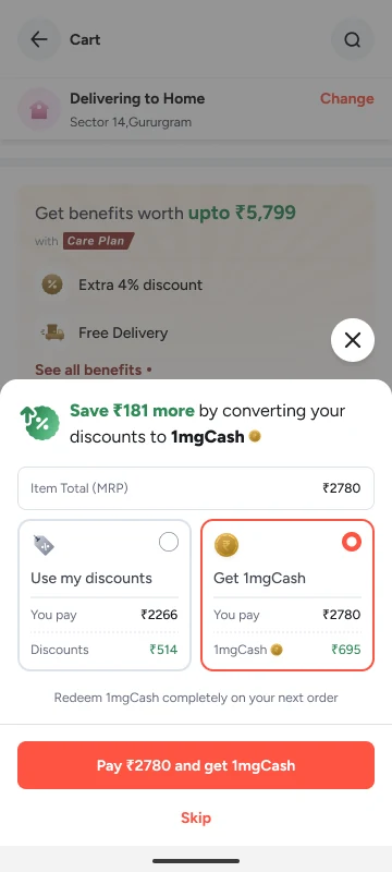
"Get exclusive benefits worth upto ₹5,799" says it is a maximum, and it is the sum of the capped benefits below it.
"Extra 4% off on orders above ₹249, worth upto ₹500." "Free deliveries above ₹249 for first 20 orders, worth upto ₹1,000." People can check each claim against their own cart.
"Save ₹42 on this order" is what this cart saves. It sits apart from the headline, so the two are never confused.
"Add care plan for 3 months at ₹165". Declining now reads "Maybe later", so saying no no longer sounds like losing money.
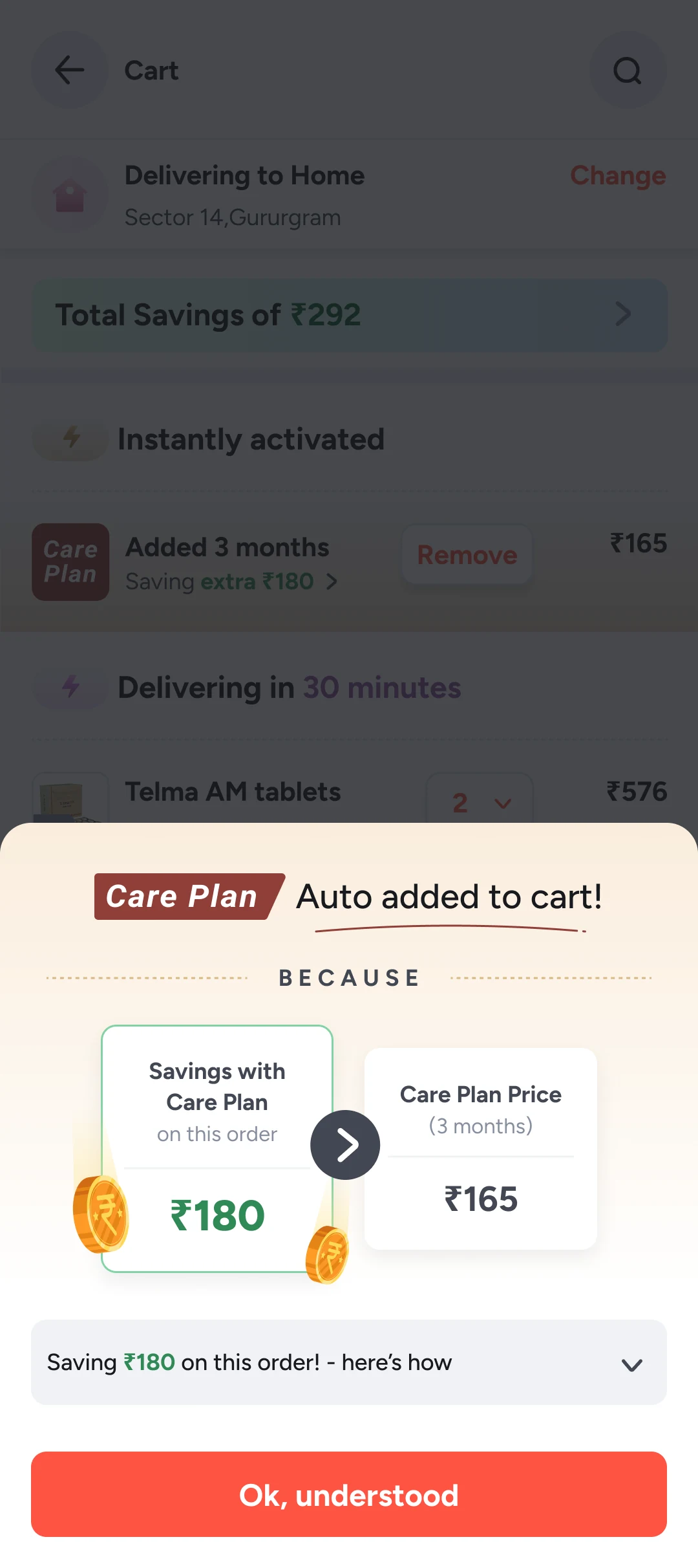
I also designed Auto Add, which put Care Plan in the cart on its own when it paid for itself. It kept sales high, but usability testing showed people missed it or resented it, so we removed it. The full account is in Auto Add.
Each touchpoint shows only what fits where you are. I also designed one page that shows all of it.
Shipped
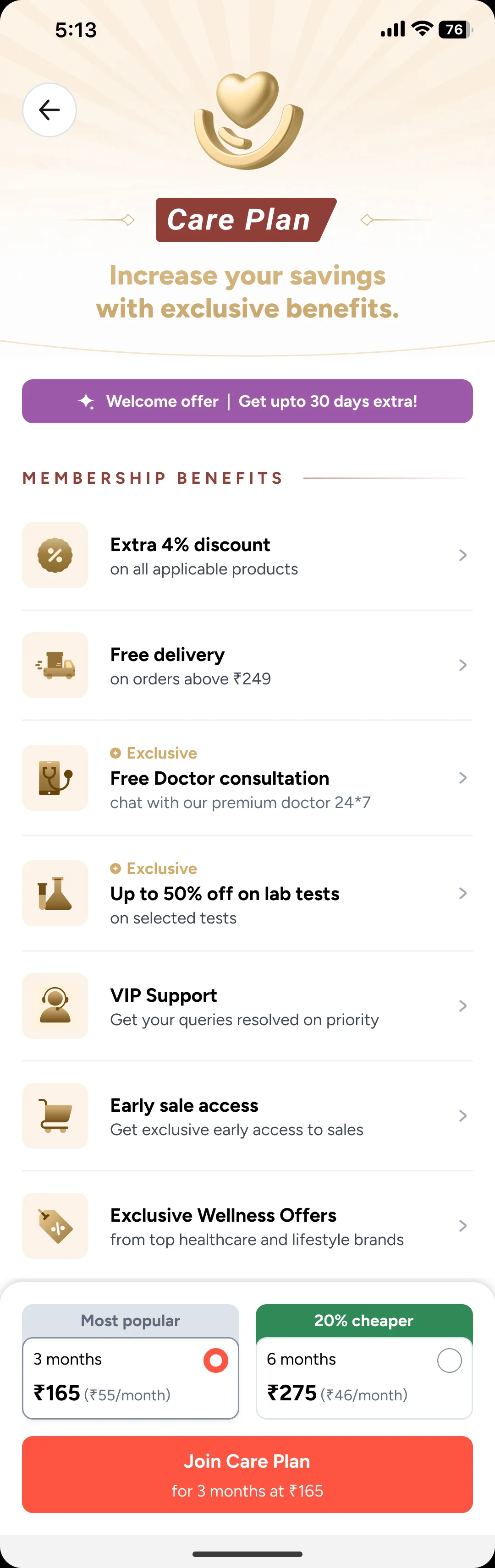
The other touchpoints show the benefits that fit where you are. This page shows all of them.
Free delivery on orders above ₹249. An extra 4% on all applicable products. Free doctor consultations and lab test discounts are marked Exclusive.
Three months at ₹165, which is ₹55 a month. Six months at ₹275, which is ₹46 a month and tagged 20% cheaper.
For members, I designed a Savings page. It did not ship because the team lacked the resources and had other priorities, not because we found anything wrong with the design. I’m showing it because the thinking holds up: it shows what the plan has given back, what is left to use, and how to get help.
Designed, not shipped

"Membership expiring in 3 Days!" with an Extend Plan button and the offer to renew now.
"₹503 saved on your current plan. You saved >2x of what you paid!" The saving is shown against the price.
Each benefit shows how many orders are left, and a button to use it: "Extra discount, 12 orders left, Order Now".
Premium Support sits in the same list, with a Chat button.
The product page, the upgrade sheet and the coupons screen were updated to follow the same rules: show the price, show the condition, leave the choice to the person.
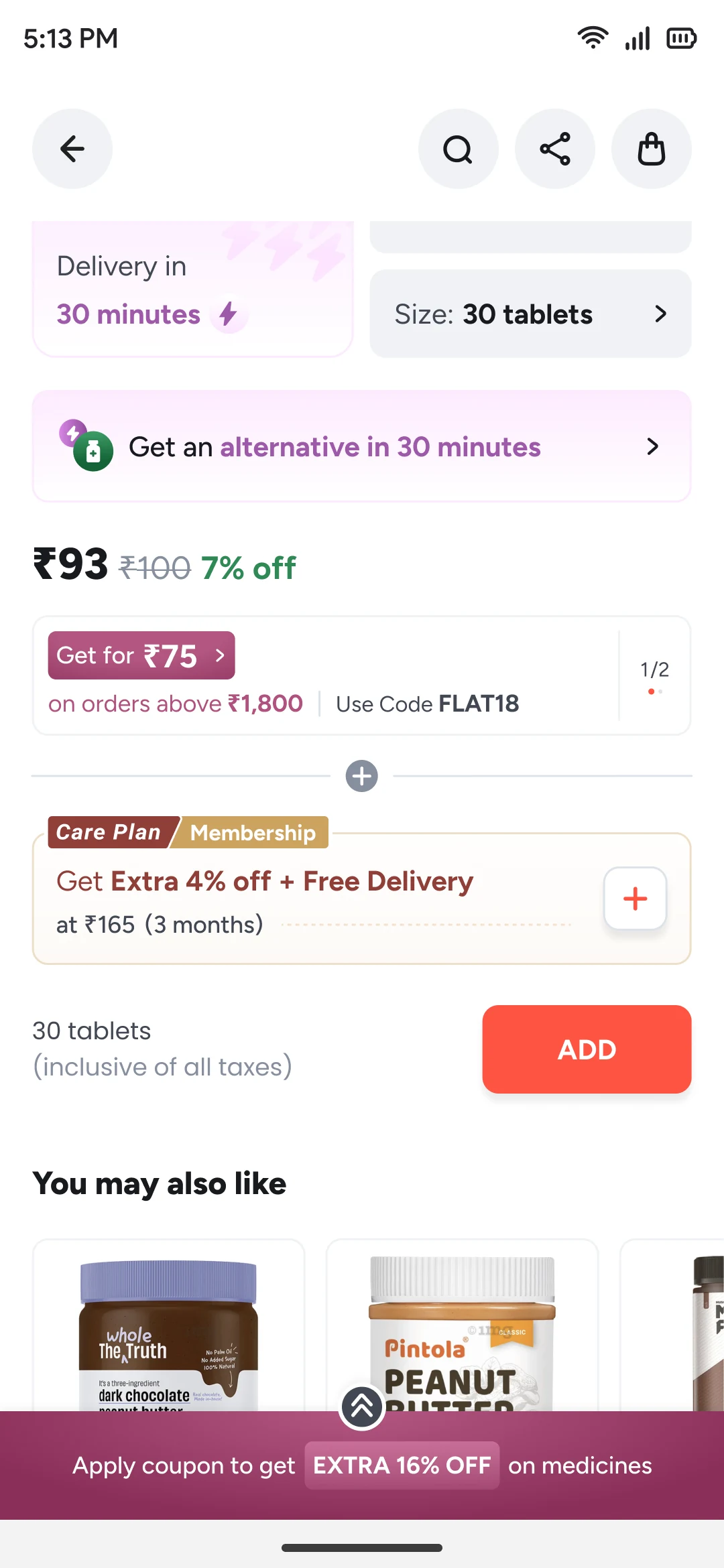
"Get Extra 4% off + Free Delivery at ₹165 (3 months)" sits under the product price, with a plus button to add it.
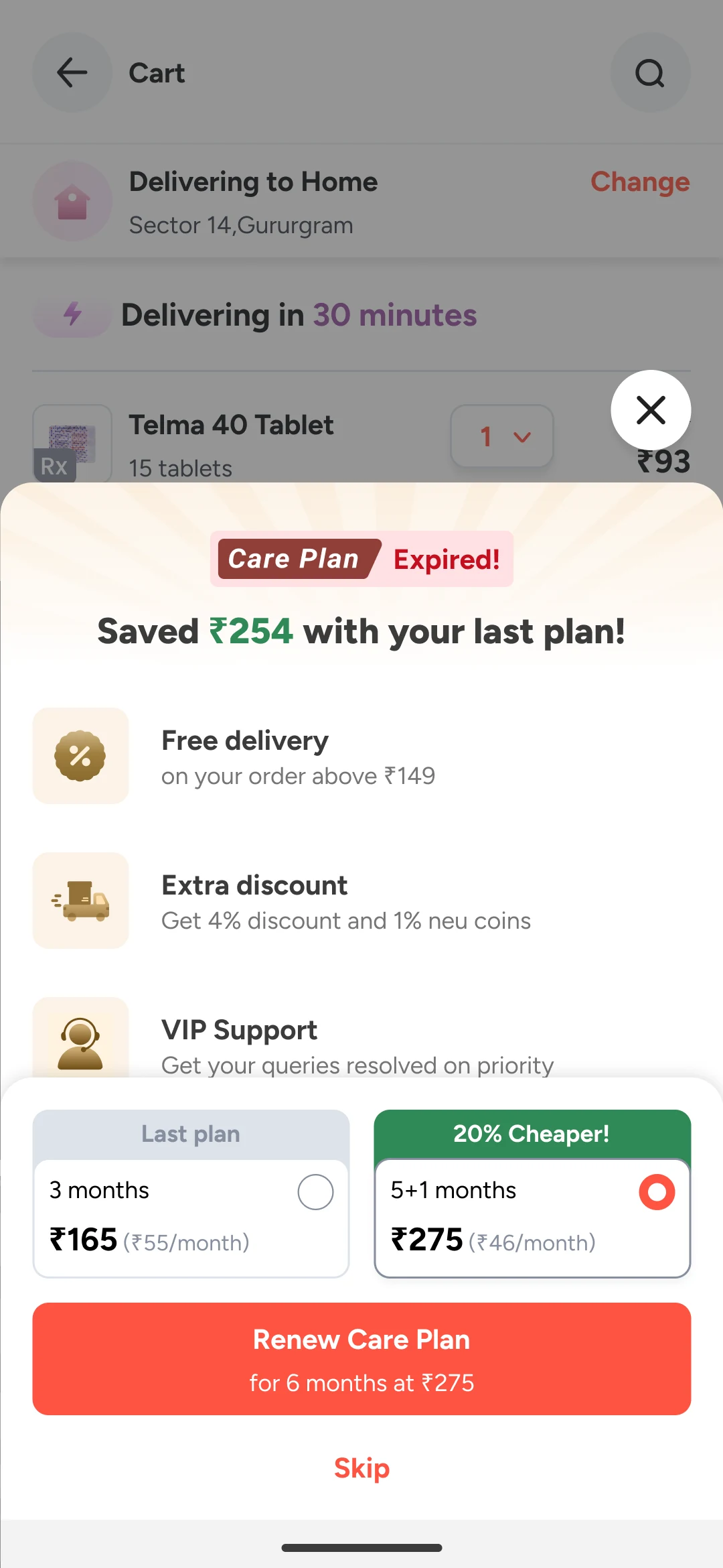
"Care Plan Expired! Saved ₹254 with your last plan!" puts the value first.
Last plan: 3 months at ₹165 (₹55/month). The other choice: 5+1 months at ₹275 (₹46/month), tagged 20% cheaper.
"Renew Care Plan for 6 months at ₹275". "Skip" stays below it.
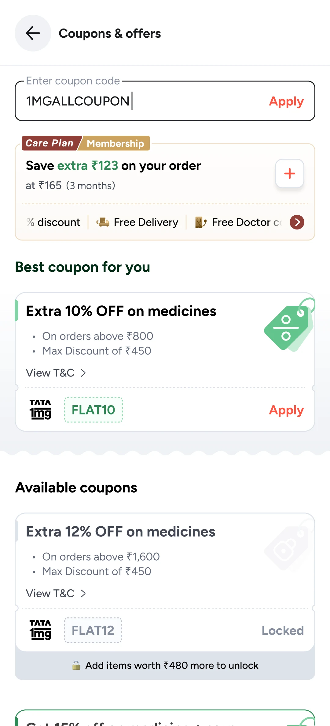
"Save extra ₹123 on your order at ₹165 (3 months)" appears above the coupons, with a plus button to add it.
Discount, Free Delivery and Free Doctor consultation sit in one row on the card.
transparency score, against the target of 8
pricing complaints. The ones that remained were about delivery and support
sales dipped at first, then benefit use, retention and cart value went up
A sales number can hide a trust problem. Auto Add looked like a win on the dashboard and failed in usability tests.
Honesty took more than better copy. It changed the logic: what we show, when we show it, and whether we decide for the person.
A pill button at the top of the home screen opened the benefits page, so members could use things like free doctor consultations. It barely moved usage. Showing benefits at onboarding and at renewal, and sending emails and WhatsApp messages, lifted it a little. My read: people use a benefit when they need it, not because a button reminds them.
A higher-priced plan for power users, with richer benefits. Few signed up, and it cost 1mg too much to run. We scrapped it after early testing.
A plan built around long-term conditions such as diabetes or blood pressure. A click test on the home page drew very few clicks, because we couldn’t tell who had which condition and so couldn’t reach the right people. We shelved it for later.