Late 2024 to 2026Shipped
Care Plan
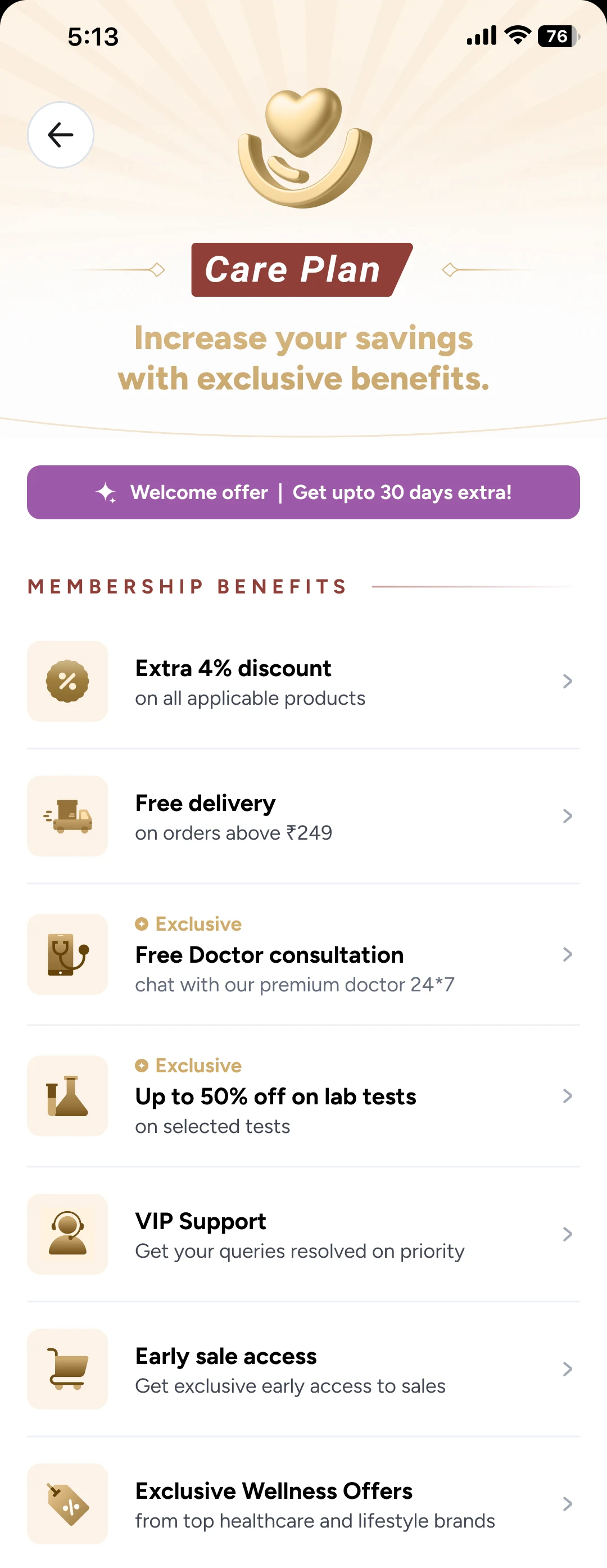
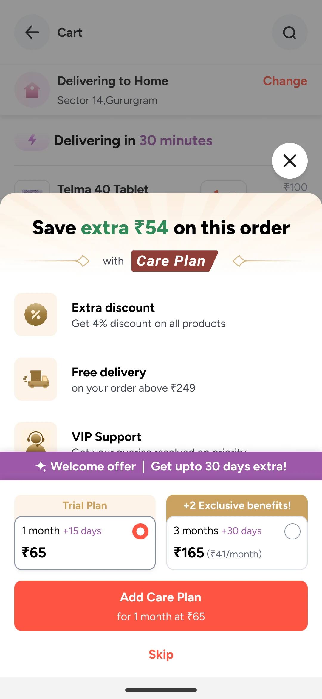
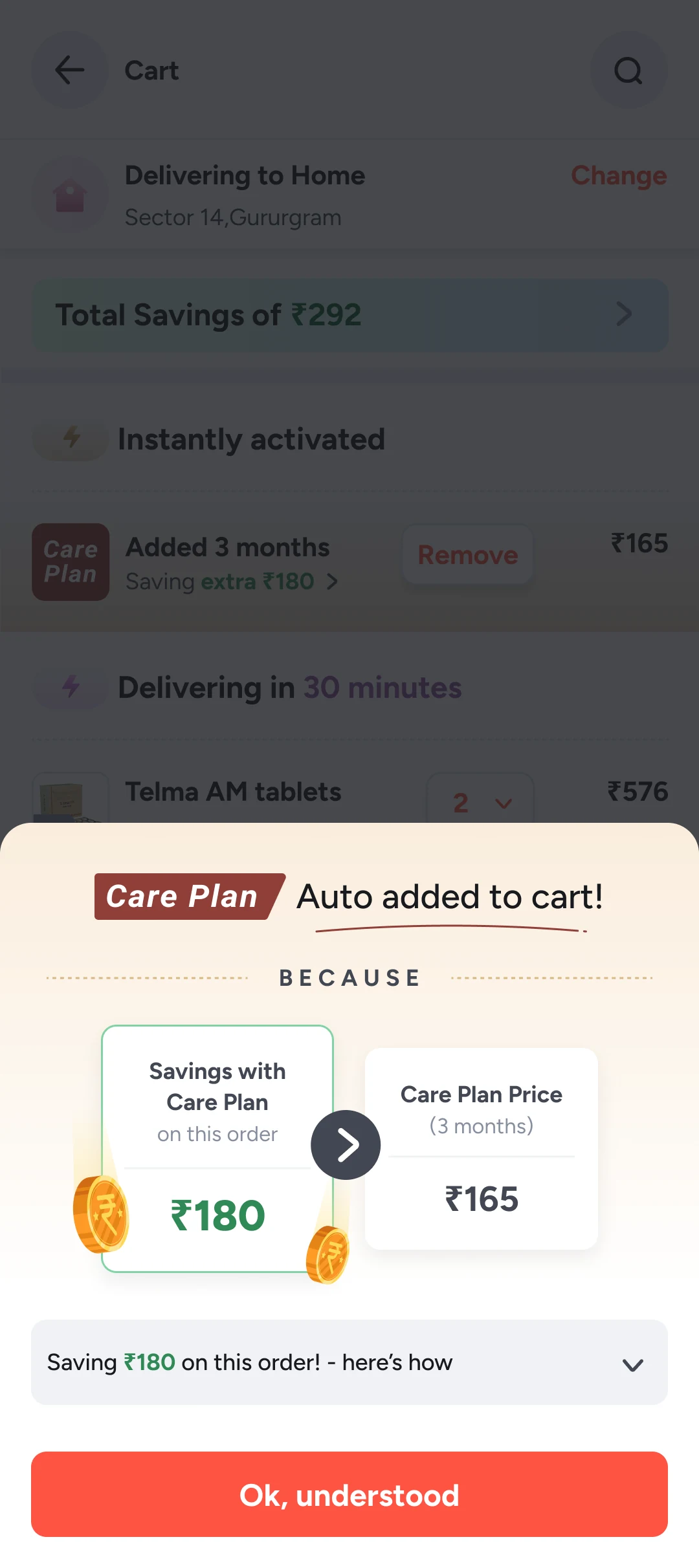
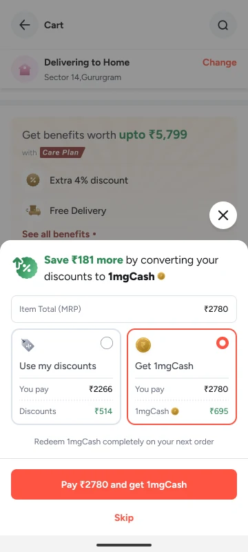
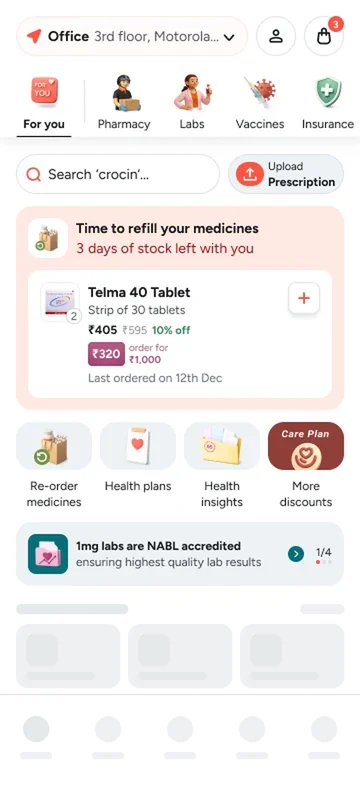
Making Care Plan honest about what it costs and what it gives
Currently doing an MSc at Politecnico di Milano
Designer with specialisation in Product, Motion, AI and Research
Previously at
 Product Designer I, 2024 to 2026
Late 2024 to 2026Shipped
Making Care Plan honest about what it costs and what it gives

B.Des, IIITDM JabalpurConcept
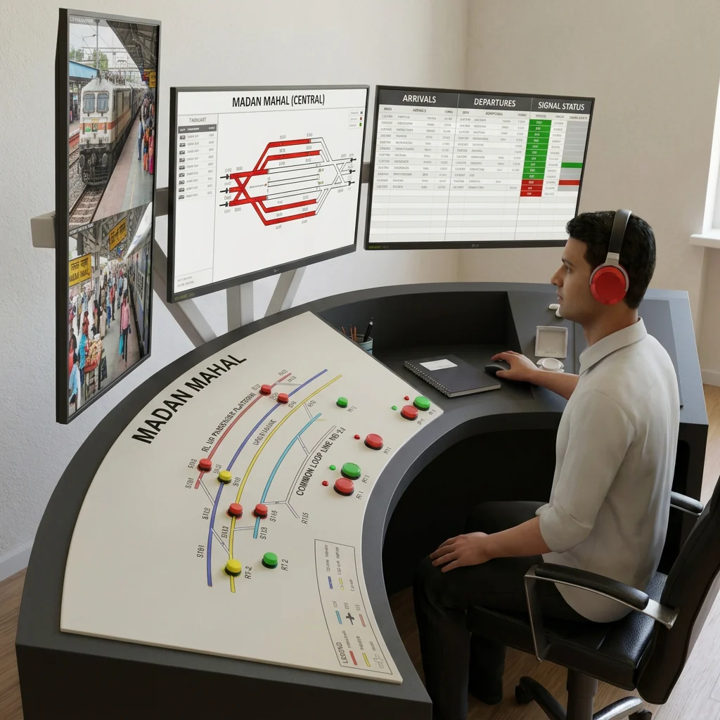
Redesigning a station master's control panel
Products I am building, freelance and side projects.
Open to new roles
Redesigning Creator Studio so more people post
Arré Voice · Creator StudioShipped5 min read
I rebuilt Arré Voice's recording studio into a single track-style editor with Quick and Pro modes; user content creation rose by 40%.
Screens recreated where needed
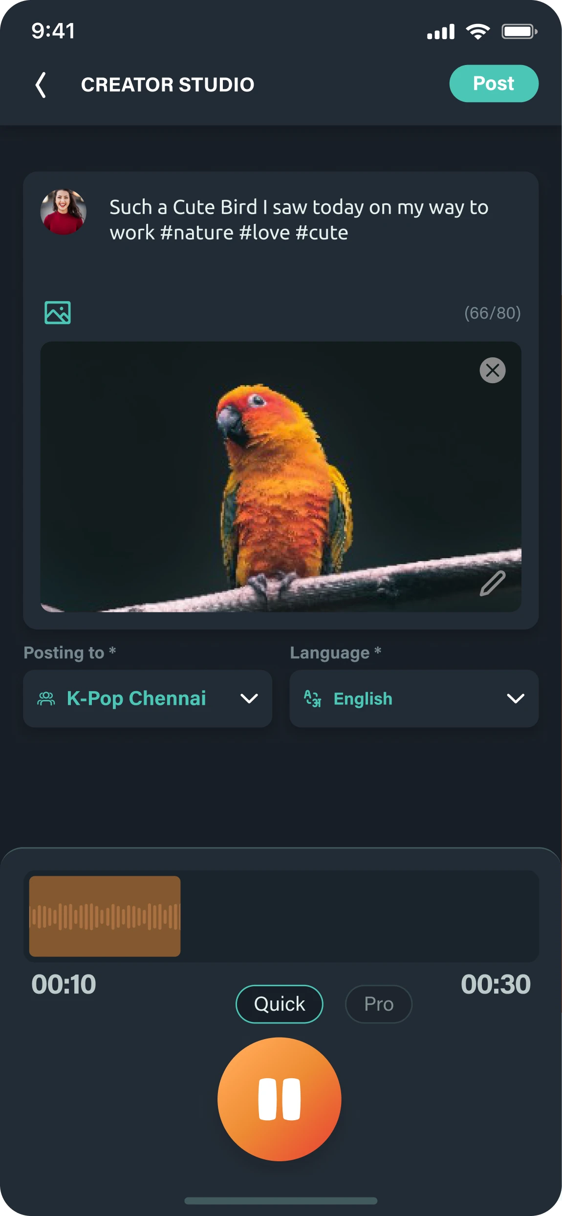
Arré Voice is India's first women-led short-form audio social platform, built around 30-second "voicepods" recorded in its Creator Studio. Every release added features, and the studio became a place people got lost: steps split across screens, effects that were hard to preview, and Record sitting right next to Post. Through interviews, surveys and observation, we found two kinds of creators with very different needs. I first rebuilt the studio as one track-style editor like the video apps people already knew, then added Quick and Pro modes, like a camera app, so each creator gets the right amount of tooling. Content creation rose by 40%.
Arré Voice is India’s first women-led short-form audio social platform. People create, listen to and share 30-second audio posts called voicepods, all recorded in the app’s Creator Studio.
The studio is where every piece of content is made before it is posted. Think of the camera in Instagram, or the box where you type a post on Facebook or X. It has shaped both Arré Voice’s past and its future, and it became my bachelor’s design thesis, Revamping Creator Studio.
Every release added features, and the studio grew into a place people got lost. Most of the features were not being used, and the navigation confused people. It also limited what the product could add later.
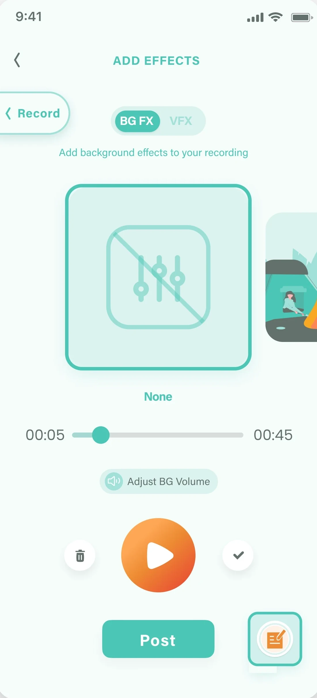
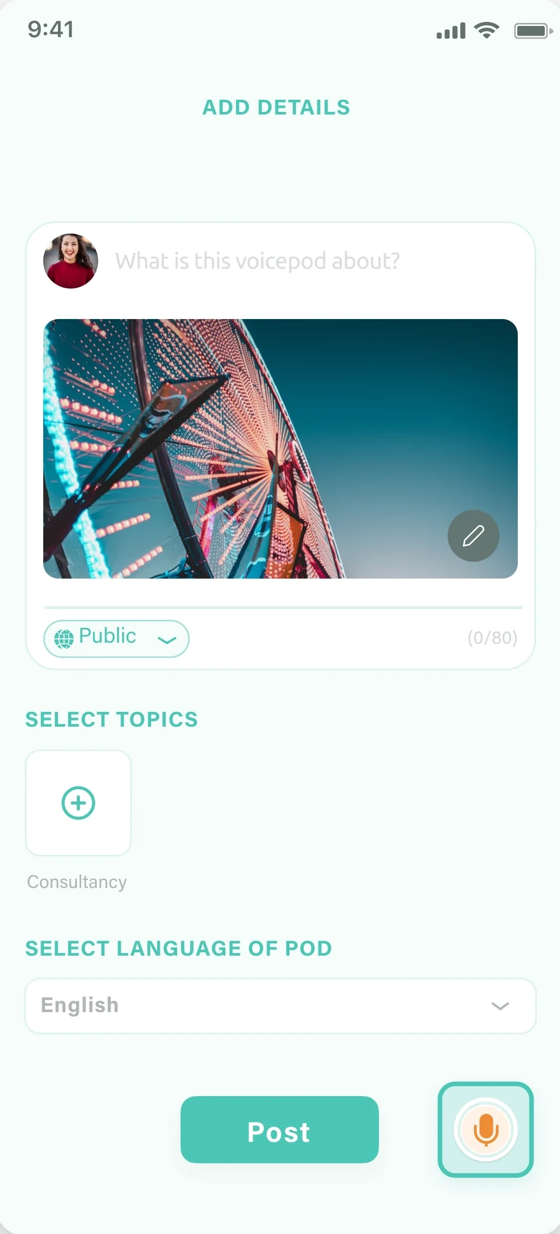
Steps were spread across separate screens with no clear order, and Record sat right next to Post. The buttons were placed without thinking about the task flow, and the thesis gave that separation a name: parallelisation. Making creation simple and efficient was no longer optional. Less confusion and less overwhelm should mean more creation, and with it better creator retention and better content.
My main goal was to raise the task completion rate and improve the experience, so creating a post took as few steps as possible.
We used interviews, surveys and observation. The same problems kept coming up:
The editing limits were specific. You could not delete a section or move a clip between tracks. You could not add more sounds or import audio files. Searching filters and background music was hard.
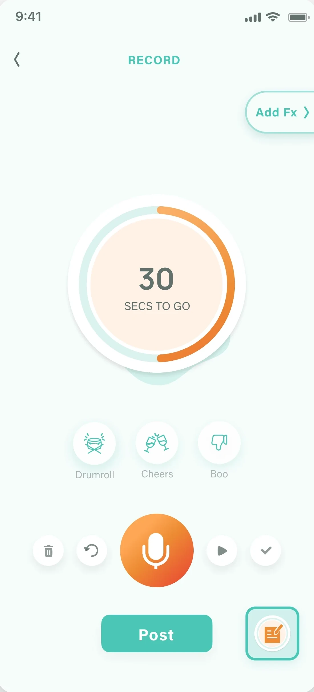
A 30 second timer and the record button, with Post sitting right under them.
Background effects are chosen on a separate screen, with a slider to preview them.
Caption, cover image, topics and language each wait on their own screen before posting.
I built profiles from surveys, observational studies and interviews, then looked at what each group needed, wanted and did. Two kinds of creator had to share one studio.
Power users are frequent creators. They aim for professional-level content and want every tool in the studio. Casual users post now and then, around an event or when they want to share something. They care little about sound effects and background music. For them it is like sending a voice message on WhatsApp.
We started with function. I rebuilt the studio as a single track-style editor, like the video apps people already used, so adding effects and importing recordings felt familiar.
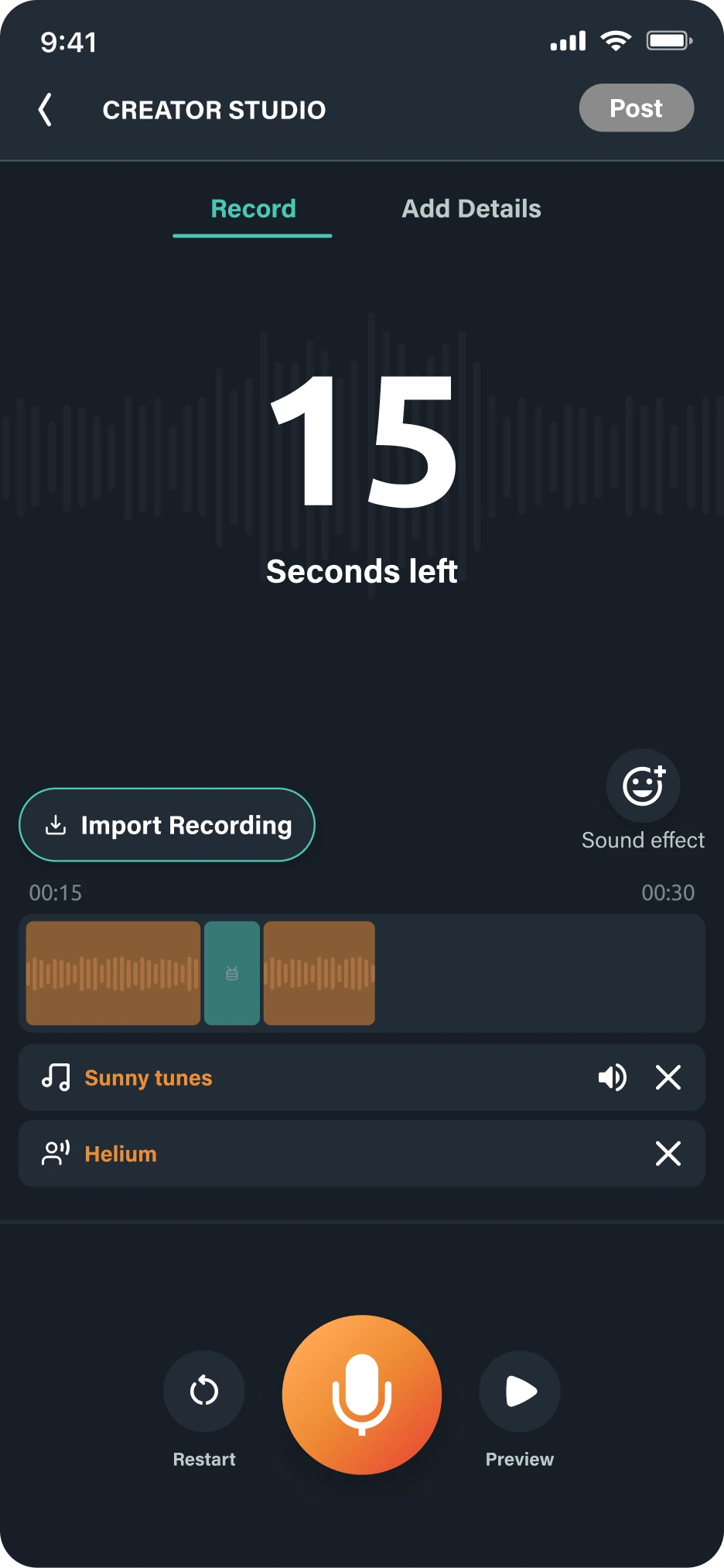
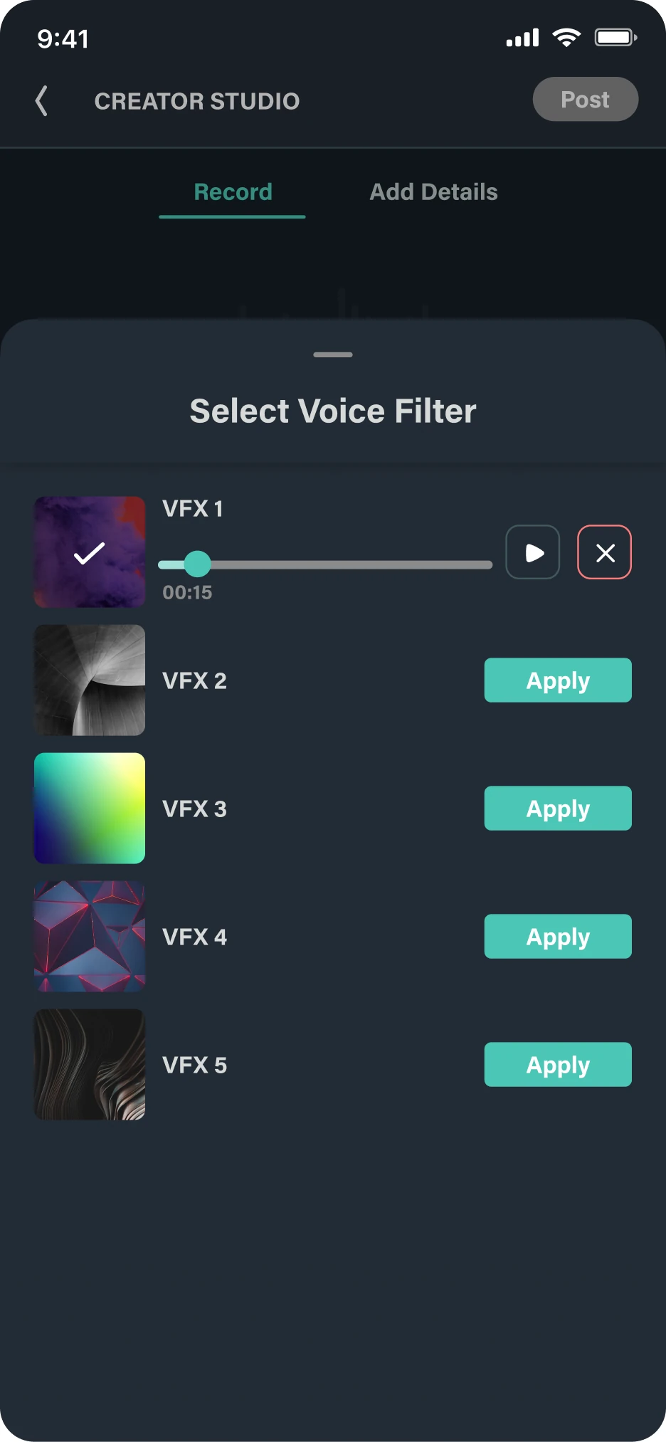
Select a clip, delete it or move it across the tracks. The idea comes from video editing apps people already know.
Voice filters and effects are chosen from a panel on the same screen as the timeline.
Once that shipped, we personalised it. We dropped the split between screens and pages, and gave people everything they need without leaving the one screen. A Quick and a Pro mode, like a camera app, lets creators switch between simple and full editing. Quick keeps new users from being overwhelmed. Pro keeps the tools for people who want them. Recording, captions and images moved onto one screen.
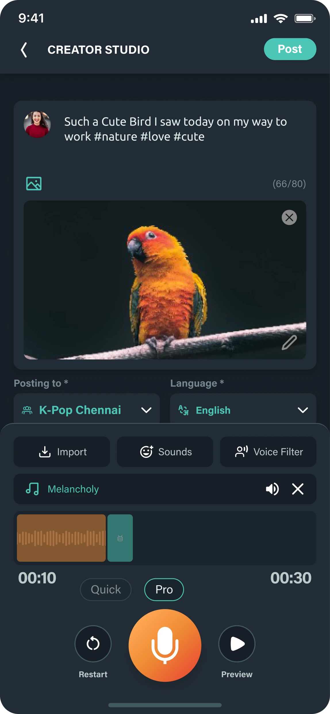
Recording, captions and the image sit on one screen. New users can post without much confusion.
The Quick and Pro switch sits above the record button, like the modes in a camera app.
The full track editor: import recordings, add sounds, apply voice filters.
Nothing moves to another page. The extra tools open on the screen the creator is already on.
The track-style editor with Quick and Pro modes, with better voice filters, background music, effects and insertable sounds, and the option to import recordings. Background music can be previewed and sorted by mood. It landed over several releases, and that process shaped the Creator Studio people use today.
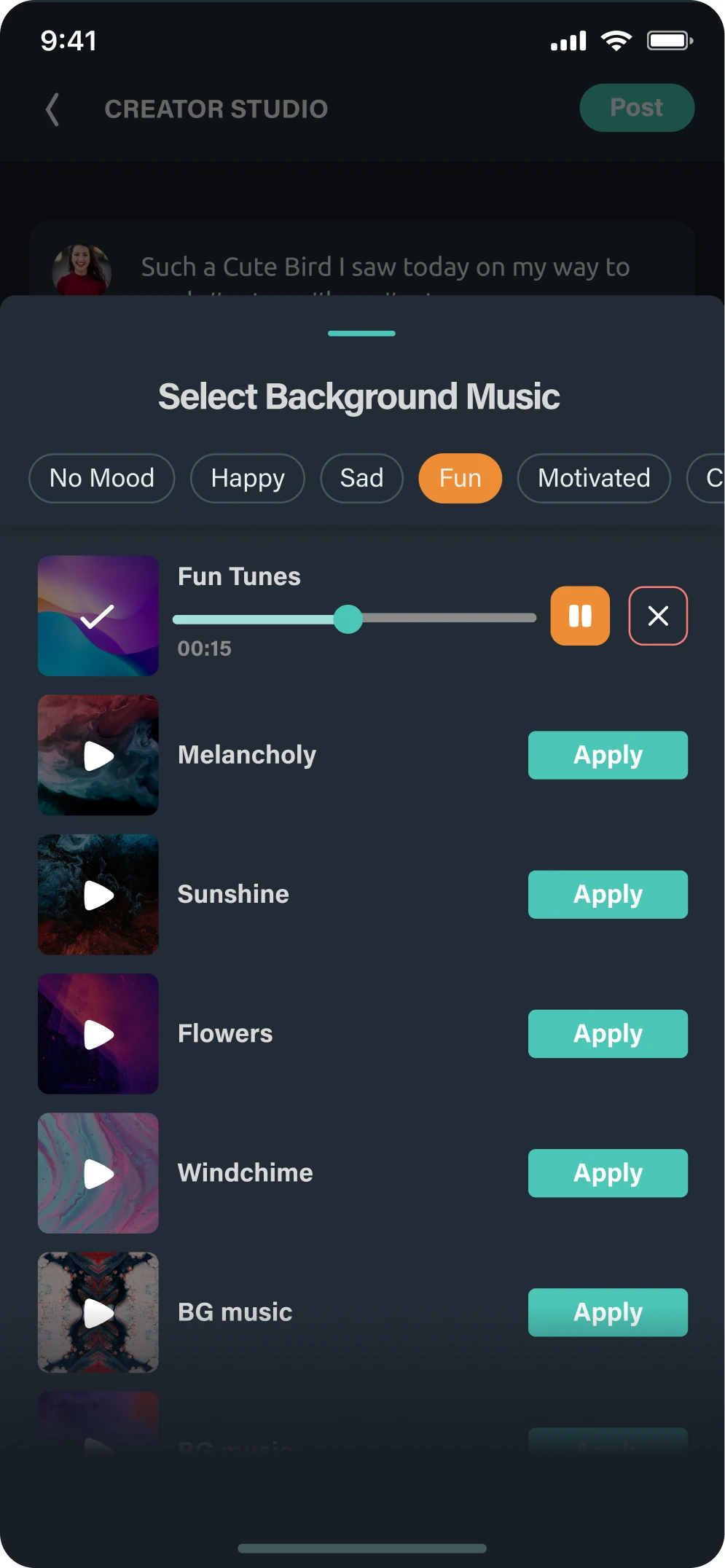
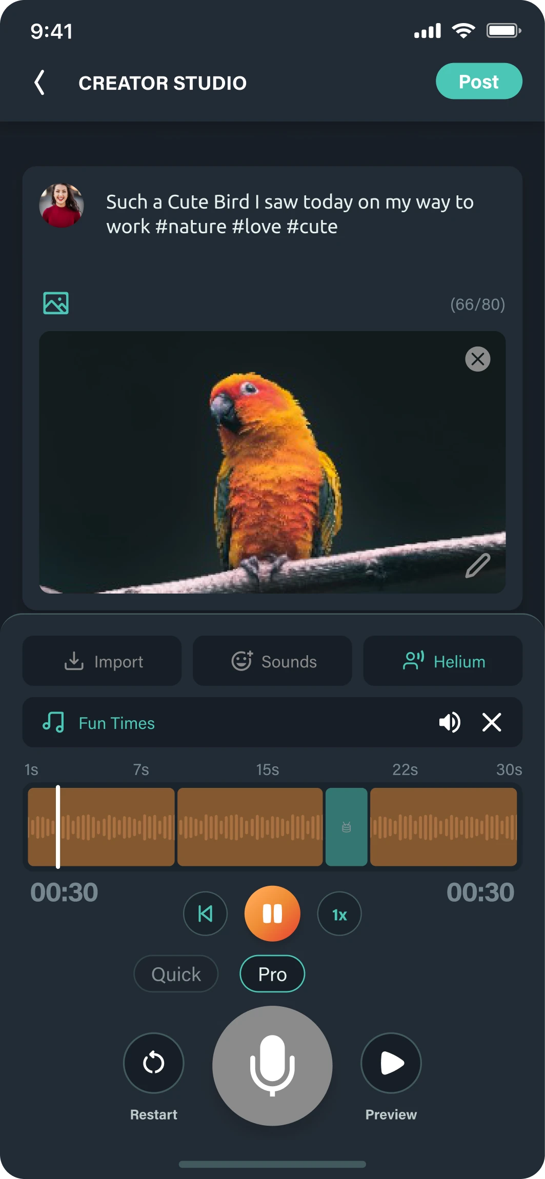
Recording, captions and the cover image on one screen, with the Quick and Pro switch under the timeline.
Background music is sorted by mood and can be previewed before it is applied.
The recording plays back with its caption and image before it is posted.
Different people use the same product differently, and the product should bend to them. Complex flows are best explained with interactive prototypes, not static screens.
What the thesis taught me:
Beyond the studio, I also took Voicepools, where a question gets answered with audio clips, and Voiceclubs, creator communities, from concept to launch. Both are live in the app today.